


Every time we write something is an opportunity to consider typography, from the fonts we choose to the way we style and format text.
By taking an inclusive approach and designing with people with disability at the centre, we can create more accessible typography for everyone.
This blog is the second part of a two-part series exploring typography in Inclusive Design.
The series covers:
- The importance of inclusive typography and 8 key tips for accessible typography (Part 1)
- Choosing an accessible typeface and laying out text (Part 2)
Typography in Inclusive Design
View the Typography in Inclusive Design video with Jacinta Oakley – our free lunchtime webinar held on February 24, 2022.
'So, what font should I use?'
A common question we get at Digital Access, which many of you are reading this blog, may have is: 'Which font should I use?' Or 'Which font is the most accessible?'
Unfortunately, there is no magical 'one size fits all' answer to this question. However, we can provide some practical advice on where to start when choosing an accessible typeface.
This section of the blog will discuss:
- How to put the '8 tips for accessible typography' into practice when choosing and styling typefaces
- Some common typefaces that are considered more accessible (and why).
Consider the context
Firstly, when choosing a typeface, it's important to consider the context your text will be used in and the purpose of the communication or product it is part of.
This may involve considering things like:
- What tone do you want the text to convey?
- Who is your audience?
- What type of text content (i.e. body text, headings)?
- Where / what platforms will the text be read?
These questions can help narrow down the typefaces that may be most appropriate.
Importantly, we recognise that there can be constraints around choosing a typeface like pre-existing brand and style guides. Ideally, branding is developed with accessibility in mind; however, this is not always the case. Even when restricted to using a specific typeface, the way the typeface is sized, styled, and formatted (including spacing between letters and lines of text, avoiding italics, etc.) can improve the typeface's accessibility. See the Typographic layout and styling section of this blog for more information.
Understanding different 'types' of typefaces
Choosing a typeface can be overwhelming, as there are many different styles and varieties to choose from.
Understanding how typefaces are classified can help you narrow down your options to a specific group of typefaces.
Typefaces are classified based on various factors, including their historical origins, the period in which they were designed, and their visual properties. This makes type classification a very complex field, and there is deliberation about how some typefaces are classified.
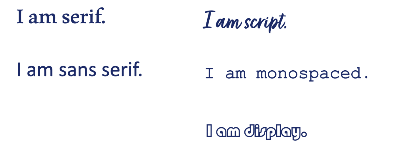
From an accessibility point of view, it's useful to discuss five common typeface groups (called families). These typeface families are:
- Serif
- Sans serif
- Script
- Monospace
- Display.
The image below represents the distinctive visual styles of these five different typeface families.
This blog will focus primarily on exploring the accessibility of Serif and Sans serif typefaces. The discussion about which of these two typeface families is more accessible for digital use is ongoing in the accessibility and inclusion space.
The other three families highlighted above, Script, Monospace and Display, will be discussed briefly; however, they generally have several accessibility issues. Therefore, we recommend avoiding or limiting their use.
The below section of the blog highlights the key characteristics and accessibility issues that may be associated with typefaces in each of these families and recommendations for using them accessibly.
Serif typefaces
Serif typefaces are distinct because of the small lines or stokes attached to the ends of larger strokes in a letter (like the vertical stroke of a capital 'I'). These small strokes (called serifs) were thought to have originated from early typography carved in stone, where the serifs were added to neaten the ends of the letters after they were carved.
Key accessibility considerations:
- Serif typefaces are considered the most accessible typeface family for long-form printed content like newspapers and novels.
- They were traditionally not considered accessible for digital contexts due to serifs' taking up more pixels' and contributing to unnecessary 'noise' on screen; however, this view is somewhat outdated and based on lower resolution screens available to us in the past.
- Some issues to consider may include thin lines and excessive contrast between thick and thin letter strokes, smaller x-heights and closer counter spaces created by thick serifs.
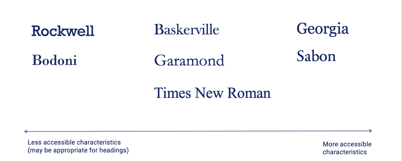
The image below shows some common serif typefaces on a spectrum, from those with less accessible features (on the left) to more accessible features (on the right).
Georgia and Sabon typefaces are highlighted as having the most accessible features of the typefaces represented. Baskerville, Garamond and Times New Roman rank in the middle, whilst Rockwell and Bodoni have less accessible features.
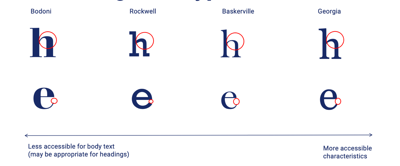
Lets' take a closer look at what makes the typefaces along this spectrum more or less accessible. The image below highlights the line contrast, letter shape and aperture of four typefaces along the spectrum. The typeface, Georgia, sits at the highly accessible end of the spectrum due to open apertures, large counter spaces and contrasting line thickness (without extremely thin strokes). On the other hand, typefaces such as Bodoni and Rockwell are classified as less accessible due to lack of variation in line thickness (Rockwell) and variation in line thickness that is too extreme, including very thin strokes (Bodoni).
Recommendations:
Serif typefaces can be highly accessible for text in digital contexts.
They are primarily recommended for:
- Larger text like headings
- Larger body text o High-resolution screens.
Generally, consider avoiding the use of Serif typefaces:
- For smaller body text on screens
- On lower-resolution screens (I.e. payment terminals).
Sans serif typefaces
Sans serif typefaces (sans meaning without) lack the small lines, or serifs, on the ends of larger character strokes.
Key accessibility considerations:
- Sans serifs are traditionally considered the most accessible typeface family for digital content due to simple, clean letterforms.
- Some issues to consider may include uniformity of characters, 'mirroring' and 'imposter' letters and closed apertures (particularly in geometric style typefaces).
The image below shows some common Sans serif typefaces on a spectrum, from those with less accessible features (on the left) to more accessible features (on the right).
The typefaces Calibri, Verdana and Tahoma are highlighted as having the most accessible features of the typefaces represented. Helvetica, Arial and Grotesque rank in the middle, whilst Future, Century Gothic and Avenir Next have less accessible features.
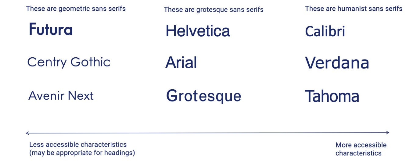
There is a relationship between where the typeface sits on the accessibility scale and the 'type' of sans serif. Typefaces in the Sans serif family can be broken down into sub-classifications based on their characteristics, when they were designed and what inspires their design.
Calibri, Verdana and Tahoma are classified as 'Humanist' Sans serifs. Humanist typefaces are:
- Inspired by calligraphy and handwritten letterforms.
- Generally designed for optimal legibility and readability.
Helvetica, Arial and Grotesque are known as 'Grotesque' or 'Neo-grotesque' sans serifs. Grotesque and neo-grotesque typefaces are:
- The Grotesque category covers the early Sans serifs designed in the 19th century and early 20th century. These are closely related to Neo-grotesque typefaces, inspired by the later grotesque typefaces.
- Neo-grotesque typefaces were designed for simplicity and neutrality. These qualities made them extremely popular, and they remain that way. However, simplicity does not necessarily translate to legibility.
Future, Century Gothic and Avenir Next are all 'geometric' sans serif. Geometric typefaces are:
- Geometric Sans serifs are inspired by are built on geometric shapes.
- The characters often have very circular bowls and are otherwise typically very rectangular.
- Many characters are visually similar within geometric typefaces.
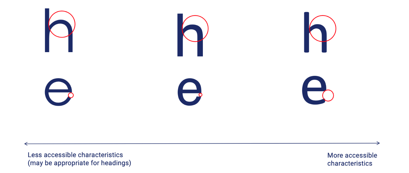
Lets' take a closer look at what makes the typefaces along this spectrum more or less accessible. The image below highlights the letter shape and aperture of four typefaces along the spectrum. The typeface Calibri sits at the highly accessible end of the spectrum due to open apertures and large counter spaces. On the other hand, typefaces such as Helvetica and Bodoni are less accessible due to their more uniform letter shapes and smaller apertures.
Recommendations:
Sans serif typefaces are considered an accessible option for web content.
They are generally the most accessible option for:
- Larger text like headings
- Smaller body text
- High or low-resolution screens.
Opt for humanist sans serifs such as Calibri, Verdana and Tahoma. Note that the typefaces recommended in this blog are very common examples, but numerous other highly accessible humanist typefaces are available. For example, some new typefaces from Microsoft (such as Seaford and Skeena), set to be released in 2022, also have humanist qualities.
We suggest using the '8 key tips for accessible typography' to assess any typeface you consider for accessibility.
Script typefaces
Script typefaces have a handwritten, calligraphic style and are often decorative and ornate. They can offer a warm, classical, human tone.
Key accessibility considerations:
- Joined letters (ligatures), often italicised, irregular/unfamiliar letter shapes.
Recommendations:
- Using a script font is recommended only for small amounts of text like a logo or title.
- Consider using a Script typeface that does not have ligatures. For example, many 'Cursive' typefaces have a handwritten style without using ligatures.
Monospace typefaces
Monospaced typefaces have characters (and spaces between characters) that are the same width, giving the text the appearance of typing from an old monospaced typewriter. They can offer a modern, minimalist or playful tone.
Key accessibility considerations:
- Lack of proportionate spacing between letters can make individual letters and words more difficult to recognise.
Recommendations:
- Not recommended for long passages of text.
- It can be useful for presenting numbers (I.e. a phone number) and is often used for text in coding (i.e. web coding).
Display typefaces
Display typefaces are customised, stylised typefaces that don't fall under any previously mentioned families. Often ornate, quirky and fun in their visual style, these typefaces are many and varied.
Key accessibility considerations:
- Unfamiliar characters, use of ligatures and italics.
- This may lead to issues with screen reader software not recognising unfamiliar characters (depending on the code sitting behind the text).
- Other possible accessibility issues depend on the typeface.
Recommendations:
- Generally, avoid or limit the use of display typefaces. However, if they must be used (I.e. for a logo or heading), assess them based on the 8 key tips for accessible typography discussed in part 1 of this blog series.
- Test with screen reader software to ensure text is read correctly to users.
Typefaces designed for people with disabilities
Many typefaces have been designed specifically for people with disabilities. We are often asked at Digital Access about the accessibility of these typefaces and if/when they should be used.
Despite their intended purpose, these typefaces are not a 'catch-all' regarding accessibility. Therefore, testing with users in context is still critical to determine their appropriateness and accessibility.
OpenDyslexic and Dyslexie are two typefaces designed for people with Dyslexia. They both feature 'weighted' or thicker bases of letters. This feature was intended to provide a clearer baseline for lines of text and prevent what some people with dyslexia describe as the experience of letters' swimming on the page'. However, a peer-reviewed study from 2016 highlighted that compared to other typefaces, including Arial and Times New Roman, there is an improvement in reading rate or accuracy. In addition, there was no self-reported preference for reading text in OpenDyslexic over other typefaces.
The Atkinsons Hyperlegible Typeface, named after the founder of the Braille Institute, is an example of a typeface developed to increase legibility and improve comprehension for readers with low vision.
The below image provides a visual comparison of Dyslexie, OpenDyslexic and Atkinsons Hyperlegible typefaces.
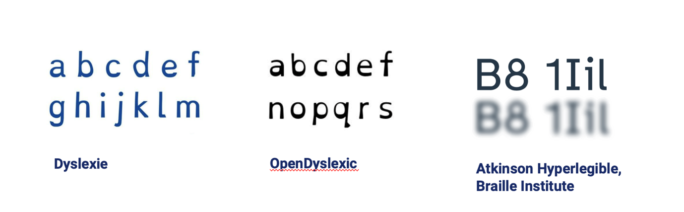
What typefaces like these have in common is that their characters are designed to have unique, distinguishable shapes. They both feature larger x-heights, open apertures and larger counter spaces. Neither employs mirroring or features imposter letters.
Ultimately, any typeface with these key qualities can be accessible, and we recommend looking for these first and foremost when working with typography.
In summary, purpose-designed typefaces for people with disability can be a great, accessible choice, but they may not always be the most appropriate solution. Engaging and testing with users in your intended audience is critical.
Summary: 'So, what font should I use?
- Generally, opt for sans serif (particularly for smaller text or lower screen resolutions).
- Serif typefaces can also be accessible if they have accessible characteristics (see the '8 key tips for accessible typography').
- Avoid other decorative fonts; if considered necessary, check for accessible characteristics.
- Typefaces designed specifically for people with disabilities are not a 'catch-all', and user testing is recommended.
Typographic layout and styling
Once you have chosen your typefaces, it's important to consider how the typeface is styled and how the text is formatted on the screen or page.
Creating visual hierarchy
Text styling, including different text sizes and weights, can help create a visual hierarchy. Visual hierarchy is when text has different visual prominence on the screen or page according to its importance or the sequence is should be read. This helps to a clear, logical order in which the users can consume the content.
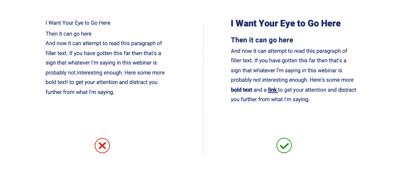
The image below highlights the importance of applying text styling to create hierarchy. The example on the left (with uniform text styling) has little or no visual hierarchy, meaning the reader's eye will wander aimlessly, and they may quickly lose interest. In the example on the right, text weight and size are varied to emphasise the heading, sub-headings, keywords and links. This gives the content a clear reading order, making it easier to read and comprehend.
Font weights
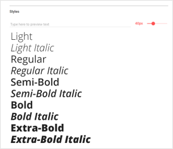
Using varied font weights can contribute to creating a visual hierarchy. Typefaces are made up of fonts of different weights, and these may have names like Thin, Light, Regular, Bold, Black (and italicised varieties for each of these).
Below is a snapshot of the variety of font weights and styles available for a specific typeface on Google Fonts.
Key recommendations:
- 'Regular' font-weight is generally ideal for body text,
- Heavier weights like 'bold' and 'black can be helpful for visually distinguishing headings (along with larger text sizes).
- Dedicated Bold fonts should be used wherever available (rather than just applying 'bold' formatting), as the character shapes and styling will be better maintained.
- Use bold for emphasising keywords.
- Use the tag instead of the tag for web content to ensure emphasis on bold text is conveyed to screen reader users (emphasis is not just visual).
- Use bold and underline to indicate links to ensure consistent link styling throughout the context so readers can recognise when content is interactive.
Generally, avoid:
- Light / thin fonts as the fine stokes can be difficult to perceive on-screen.
- Italics, particularly for large passages of text, impedes legibility and readability. Italics are often used to emphasise (I.e. on keywords or quotes); however, we recommend using bold text instead.
Typeface sizes
Text size plays an important role in creating a visual hierarchy.
It also has major implications for legibility and readability, particularly for users with low vision.
Key recommendations:
- 16px / 12pt minimum text size for body text. However, this is context dependent (based on the typeface used, font-weight, colour contrast ratios etc.), and user testing is highly recommended).
- Headings and sub-headings should be larger than body text. Unfortunately, it is difficult to provide prescriptive sizing for headings as this varies based on the number of heading levels used and other factors like font weights.
- Headings should not be smaller than body text and should be more visually prominent. For example, level 1 Headings (main headings) should be the largest and most visually prominent, followed by level 2 headings, etc.
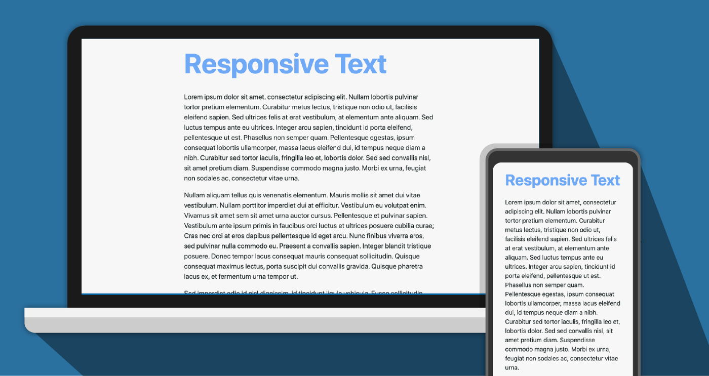
- For web content, headings should be styled relative to the body text (metrics like % or 'em'/'rem' (scalable units of size relative to the font size use) are often used). This is important to enable proportionate resizing of text for responsive websites. For example, headings and body text should proportionately downsize when someone switches from their desktop to their mobile phone to view a website.
The below image provides an example of text that has been proportionately resized for desktop and mobile devices.
Spacing between lines of text
Spacing between lines of text (also called leading) can impact readability.
Line spacing that is too tight or too loose can make it difficult for readers to follow the text from line to line, and they may lose their place in the paragraph.
The below image compares a passage of text with tight, optimal and loose line spacing.
Key Recommendations:
- Generally, opt for 1.5 times the text size between lines
- Generally, opt for 2 times the text size between paragraphs
- Use dedicated spacing tools (I.e. when designing static digital content in Microsoft or Adobe programs) to adjust the spacing between lines and paragraphs. Avoid simply using the enter key as blank lines in a document are announced and can be distracting or confusing to screen readers (particularly when there any many blank lines in a row, as users may assume the document has ended).
This page provides instructions for adjusting line and paragraph spacing in Microsoft Word.
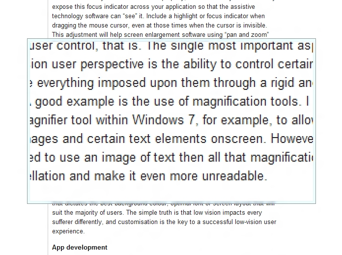
Paragraph width
Paragraph width is important for readability. However, it can impact people's ability to follow lines of text and return to the start of a new line. In addition, impacts for screen magnifier users can be significant, as long lines of text may mean users need to scroll horizontally to see the entire line of text in their magnification window. This repetitive movement can be arduous and make consuming content difficult.
Key recommendation:
- Consider a maximum of 80 characters for paragraph width.
The image below provides an example of a screen magnifier enlarging a section of text within a paragraph. Only a portion of each line of text can be viewed within the magnification window.
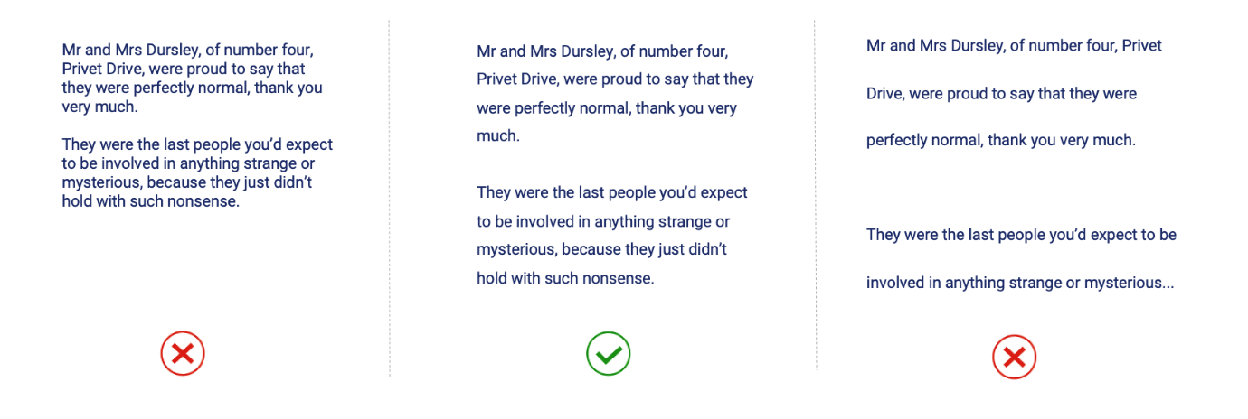
Paragraph alignment
Paragraphs of text can be aligned in various ways, which can impact readability.
Having a consistent point for the reader's eye to return to at the start of each line is important, and both left aligned and justified text provides this. However, justifying text may lead to inconsistent white spaces between words. These are called 'rivers' because they can form patterns of white space running through paragraphs of text that are distracting to the reader.
The below image compares left aligned and justified text formatting. Rivers of white space in the justified paragraph are highlighted in blue.
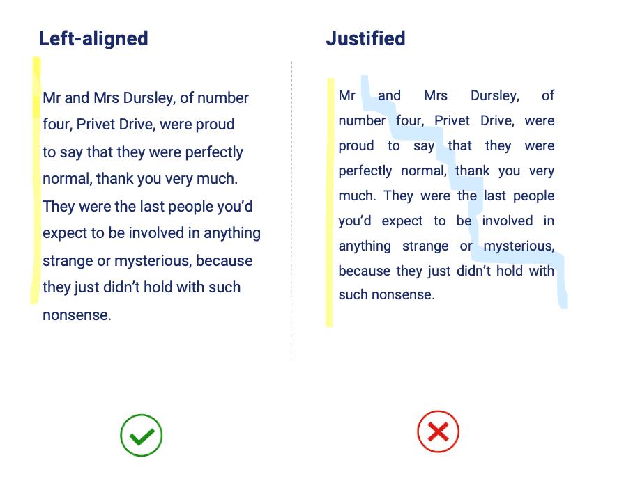
Key recommendations:
- Left-align all headings and paragraphs of text.
- Avoid justified text due to rivers.
- Avoid centre-aligned and right-aligned text due to inconsistent left-hand margin.
Colour contrast
Colour contrast ratios are important to consider for all aspects of design, not just typography.
See this previous blog post from Digital Access 'How to make social media accessible: Our top three tips for advice on accessible colour contrast, including testing colour contrast ratios. The blog focuses specifically on Social Media content, but colour contrast is applicable across contexts.
Design with people with disabilities
In closing, it's important to recognise that typography is only one part of any design, and we should consider the communication/product holistically when designing and user testing.
We highly recommend considering engaging with people with disabilities to inform and evaluate your communication or products to ensure they are accessible and inclusive.
We suggest:
- Test early and often
- Test with people with diverse disabilities and demographics
- Test across platforms (I.e. desktop and mobile)
- Consider the whole experience for people (the entire service), not just one interaction