


When posting on social media, there are many things to consider; is this what my audience wants to see? Does this align with our style guides? Have I checked my spelling, punctuation and research?
But, importantly, you should also ask yourself if your content is accessible to all audiences.
Accessibility might not be every social media manager's cup of tea, so we've put together a deep dive into three tips that can help make your content accessible to people with disability.
Accessible Social Media webinar
View the video of Accessible Social Media with Rosie Luscombe - our free lunchtime webinar held on July 1, 2021.
The webinar provides information on accessibility and inclusion for anyone who posts on social media, including social media managers and content creators.
Skip to:
- Colour contrast and use of colour
- Alt text
- Captions
- But what if I use a social media management tool?
- How will I remember all these things?
Colour contrast and use of colour
When creating social media content, choosing colours is super important. Not only can it help to grab the attention of your audience, create consistency in your branding and ensure the right mood is conveyed, but it can determine whether a whole group of users can access your content!
Colour can be split into two main different ways when considering accessibility:
- colour contrast
- use of colour
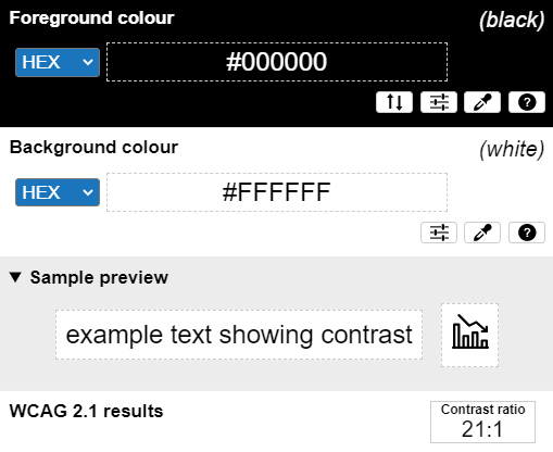
Colour contrast refers to the contrast ratio between the foreground colour (the text colour) and the background colour. WCAG 2.1, the international web accessibility guideline used in Australia, states that the visual presentation of text and images of text need to have a contrast ratio of at least 4.5:1, with some exceptions such as logos.
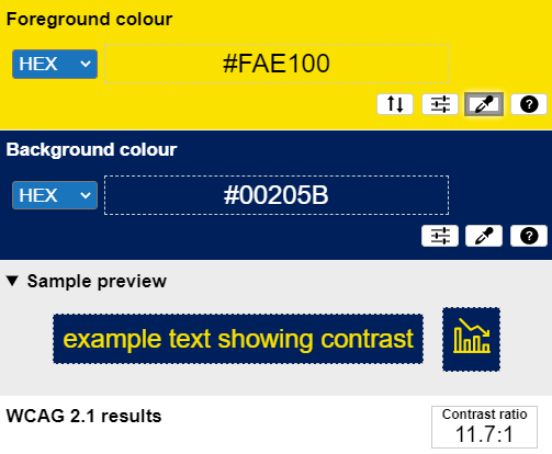
To put this into context, black text on a white background has the highest possible contrast with a 21:1 contrast ratio. The Vision Australia branding colours of yellow and dark blue have a contrast ratio of 11.7:1, well above the threshold of 4.5:1.
As the foreground and background colour move closer together in hue and brightness levels, the contrast ratio will be smaller!
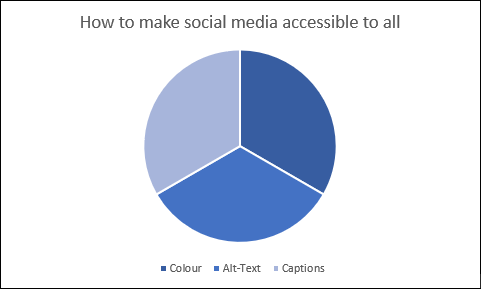
Use of colour refers to when colour alone is used to portray information; an example of this could be a pie graph that gives a colour key to identify the sections of a graph.
Example of using colour alone to represent information:
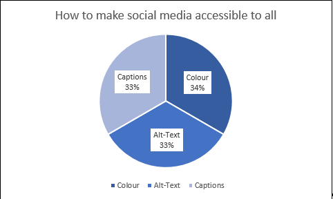
Example of how the above graph can be made accessible:
Why these are important
Having good colour contrast on social media content is vitally in allowing people who are blind or have low vision to access your content. For people with low vision, text that doesn't meet the 4.5:1 colour contrast threshold is inaccessible to them.
Without good colour contrast, crucial information may be missed. This can cause confusion and frustration among your audience and mean they are less likely to engage with your content or organisation.
Ensuring that colour alone isn't used to represent information helps people who are colour blind or have low vision to receive the full context and information of content.
In the pie graph example referred to in section 1, the different segments of the graph may not be able to be associated with the key by someone who is colour blind or has low vision.
This means they are not able to receive the full information, or they may receive the wrong information. This can negatively impact their perception of your services or content.
In addition, the pie graph may be difficult for someone with a cognitive and/or intellectual disability to navigate, as having to associate the colours from the graph with the key may be too much of a cognitive load.
People with these sorts of disabilities often require multiple ways to confirm a piece of information; using only colour can cause overwhelm and mistrust of the content.
This is great, but how can I apply it?
The principles of good colour contrast and not using colour alone to represent information can be applied to any image or video-based social media content on all major platforms.
General tips:
- Ensure to avoid using light-coloured text on a light background and dark coloured text on a dark background.
- If you are unsure whether you have a good contrast ratio, try using a colour contrast analyser
- If your colour combination does fail, try using a colour contrast determinator to find the next nearest colour that passes.
- Make sure to avoid using a colour key to categorise content and avoid using language like "you can find that information on the red tile on our Instagram feed."
- If you are unsure whether your content uses colour to convey information, try using a black and white filter on your work before posting to make sure it can still be understood or uploading your image to a colour blindness simulator.
Alt text
It's an understatement to say that images are an important part of social media.
For many companies, it's the main way they share important information, show new products, and connect with their customers and audience. But how can someone who is blind get access to that image-based information?
Alternative text or alt text is a visually hidden description of what appears in an image!
The reason it's visually hidden is that people who are blind and low vision use assistive technology called screen readers, which read the description to them.
Why is this important?
Without alt text, screen reader users do not have access to the same information that sighted people do. This means missing out on information that might only be given through images of text, missing out on knowing what a product looks like and missing out on image-based jokes.
It's important to add alt text so your blind and low vision audience members can gain access to the majority, if not the whole, of your content. This is particularly important on highly image focussed platforms such as Instagram.
This is great, but how can I apply it?
Alt text can and should be added to images on all major social media platforms.
What should I include in the alt text?
- On social media, the alt text should be describing the most important and informational elements of all images (it's rare that purely decorative images are posted on social media, they will almost always have a specific reason to why it has been chosen, and this can provide more context to the caption)
- Don't start your alt text with "image of…" screen readers will tell the user it's an image; you don't need to repeat it
- If there is text in the image, write that text in the alt-text. This ensures the screen reader user gets the same information.
- Don't go overboard; an alt text essay isn't necessary
- In contrast, don't be too general; an alt text of "three girls" isn't helpful if the image is of three women wearing a new clothing product you are launching.
- If the image is super complex, like a comic with lots of dialogue, consider writing a long text description and providing a link to the description in the caption and then make the alt text "Comic – see link to long text description in the caption".
How do I add alt text on:
Captions
Captions are one of the more common accessibility features seen on social media. They're well-loved for their usefulness when you've forgotten your earphones on the train, or you have a baby sleeping next to that you don't want to wake with the sound of your phone.
But captions are also vital for ensuring that your content is accessible to all!
There are two main types of captions to consider:
- Closed Captions
- Open Captions
Closed captions are captions that can be turned on or off according to the preference or needs of the viewer. This is mainly seen on social media through YouTube.
Open captions or burned in captions are captions that cannot be turned off and are embedded into the video. You often see this on Instagram stories or previously on TikTok videos.
Closed captions are the better option because they give the user the option of whether to have captions or not.
In some cases, closed captioning isn't available, so open captions are recommended because it's better to have captions than none at all!
Why is this important?
Captioning is important primarily so those who are deaf or hard of hearing can access the content.
Without captions, it can be extremely difficult, if not impossible, for some of your audience to access information in video-based content.
Captions can also be essential for some people with cognitive disabilities and can aid them in understanding the information being presented to them.
This is great, but how can I apply it?
General Tips:
- If you plan to use auto-captions, make sure to check their accuracy and if they aren't accurate, make sure to edit them.
- Auto captions can be super useful, but accuracy can vary based on the sound quality and accent of the person speaking. It's important to check and edit them to ensure they're correct.
- If you are writing your captions from scratch, make sure to include important sounds such as a large crash sound or a doorbell being rung.
- If you are writing open captions or burned-in captions, make sure the text is readable, has good colour contrast and isn't obscured by logos or profile pictures once uploaded.
How do I add captions on:
- Facebook captions
Currently, Instagram doesn't have inbuilt captioning software, so there are three main ways videos on Instagram can be captioned:
- Write a transcript, convert it to a captioning file and imbed into the video using video editing software, making sure the captions are open.
- Use an app with speech recognition (Instagram has recently released an app that can do this called Threads) that can create auto-captions for you and allows you to edit them.
- Make use of a transcription service to create a caption file for you to imbed into your video.
But what if I use a social media management tool and can't add these things in?
Luckily, there are social media management tools that do support a majority of these accessibility tips!
The two main tools that I have found that have good support for both alt text and captions are:
- Hootsuite
- SproutSocial
Both these tools support adding alt text on Facebook, Twitter and LinkedIn and have ways when scheduling posts to be able to also add alt text.
Unfortunately, Instagram will not let programs add alt text via their API, so alt text on Instagram cannot be added by any management tool. It needs to be added manually, as outlined in the above section.
Both Hootsuite and SproutSocial also allow captions files to be added to posts. For Hootsuite, these files can be added to Facebook posts, but it is unclear if they can be added to other platforms. For SproutSocial, caption files can be added to posts on Facebook, Twitter and YouTube!
Unfortunately, most social media management tools don't support adding alt-text and captions. This highlights the importance of knowing how to add these in manually and making sure they are part of the routine and process of posting content.
In the same way, you would check your post for spelling and grammatical errors; you should also be checking that alt text and captions have been included.
How will I remember all these things?
Making these tips a part of your posting routine might seem like a big task at first, but over time you will begin to wonder if there was a time when you didn't do these things!
We've created a checklist (Word) to help you get started with checking for accessibility before posting on social media.
Although this checklist (Word) contains more tips than what we've outlined in this article, look out for more articles to come that will do a deep dive on some of the other tips outlined.