Many organisations produce electronic direct mail (EDM) campaigns for marketing purposes. These types of campaigns land directly in people’s inboxes, so it’s imperative that their recipients, including those with a disability or impairment, have access to the information they contain.
The people responsible for email marketing usually have to use an external system, such as Campaign Monitor, to create their EDMs. But can we rely on these systems to produce EDMs that are accessible?
Recently, Campaign Monitor asked my team to review its system to ensure it was capable of producing accessible emails. This review formed the basis of my article, which demonstrates how to build an accessible EDM using three main steps:
- Build an editable template with accessibility in mind (or ask someone to build it for you)
- Use the template to create an email for your next campaign
- Test the email – display and accessibility
Although I use examples from Campaign Monitor, I think the overall learnings will help anyone who wants to know what to consider and test for when creating an HTML email.
Step 1: Build an editable email template with accessibility in mind (or ask someone to build it for you)
My aim was to build a template that we could use to quickly and easily produce accessible emails. I did this using Campaign Monitor’s custom template markup.
Development of the template required knowledge of HTML and CSS code, but once built the emails could be created without these skills. If you don’t have the skills needed to build the template, you may find this section helpful when briefing the person who will create it for you.
Email template requirements
I built an HTML email template with inline styles. To meet basic accessibility requirements the email must:
- Preserve logical reading order
- Use true headings styles (not just text made to look like headings)
- Provide sufficient text colour contrast
- Provide text alternatives for images
Preserve logical reading order
WCAG success criteria: 1.3.2, 2.4.3.
Unlike web pages HTML email templates are most commonly assembled as tables to ensure layout consistency.
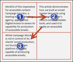
If not assembled thoughtfully people who rely on keyboard-only access might not reach the content in the order that was intended. Screen readers, for example, read aloud tabular content from left to right and from top to bottom.
The image below shows the order in which each text paragraph would be read aloud if assembled in a table of two columns and two rows.
To preserve logical reading order a better layout would be a table of two columns and one row, as shown in the image below.
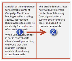
With this in mind I created the ‘shell’ for our email template using:
- A full width single cell ‘outer table’ to contain all email content
- An ‘inner table’ with the width fixed at 600px to minimise the need for horizontal scrolling
- Layout tables restricted to a single column wherever possible
True heading styles (not just text made to look like headings)
WCAG success criterion: 1.3.1.
I created all headings using HTML heading markup. By doing this, heading importance and hierarchy is conveyed to screen reader users who may not be able to see them. For example:
I selectively added styles to achieve presentation requirements. However, I minimised my use of styles as they add character weight to the code of my template which can slow download time. For example:
I added Campaign Monitor’s custom template markup to make my template headings editable. For example:
Text colour contrast
WCAG success criterion: 1.4.3.
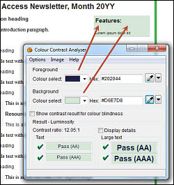
I checked all headings and text for sufficient colour contrast against their backgrounds using Vision Australia’s free Colour Contrast Analyser.
Text alternatives for images
WCAG success criterion: 1.1.1.
All informative images must have an appropriate text alternative that serves the equivalent purpose. Purely decorative images, such as spacer images, should carry a NULL alt attribute (alt=“”) to inform screen readers that the image is decorative and should be ignored.
Our logo is an informative image. Therefore, ‘alt’ text must convey its equivalent purpose to screen reader users:
Step 2: Use the template to create an email for your next campaign
With the email template created and uploaded to Campaign Monitor’s template repository, our communications staff (who don’t necessarily have working knowledge of HTML or CSS) were in a good position to start generating accessible email campaigns. To make sure of this I attempted to recreate a previous edition of our e-newsletter.
To be accessible my email content must have:
- A concise and descriptive subject line
- Headings that summarise the content that follows
- Meaningful link text
- Image alt text that serve an equivalent ‘purpose’
Subject line
WCAG success criterion: 2.4.2.
The subject line is the first text people will read or have read to them by a screen reader. It should be meaningful and descriptive, and shouldn’t repeat the sender name. I used: “Digital Access Newsletter, January 2014”.
Add articles
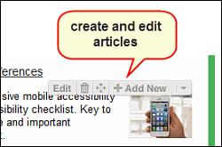
Using the toolbar I added new ‘articles’ to the e-newsletter template, then pasted content into each article.
Copying content from Microsoft Word
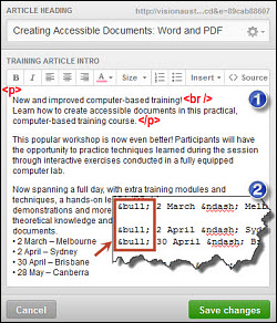 Campaign Monitor did a remarkably good job of removing extraneous Word code and special characters. However, some special characters did remain and needed to be manually cleaned up, such as line breaks and bullets.
I was pleased to find the errors could be corrected without having to go near the source code by using Campaign Monitor’s editing tools, which are much the same as those in Word. I used the editing tools to clean up line breaks and replace fake bullets with true list bullets.
The exception was text size. The tool changes ‘relative’ text size to ‘absolute’ text size, meaning that when viewed in some environments, the text size may not be as you intended it.
Headings summarise content they precede
A heading should concisely describe the content that follows it.
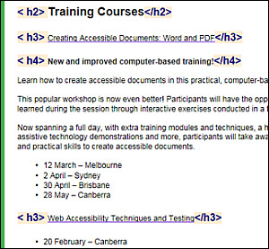
In the example below, a list of training dates and course description fall under the H4 heading “New and improved computer-based training”, all of which falls under the course name “Creating Accessible Documents: Word and PDF” (H3 heading), which in turn falls under the H2 heading “Training courses”.
Meaningful link text
WCAG success criterion: 2.4.6.
The ‘purpose’ of a link needs to be captured in the link text. Avoid generic link text such as “click here” or “read more”.
In our e-newsletter the headings link to full articles. Each link informs the reader what article they will get to when the link is followed. In this example readers are informed that the link takes them to the “AGIMO tells: NTS, WCAG 2.0 and beyond” story. Link text such as this is ideal as it is entirely unambiguous.
Add images
It was very simple to add images to the articles using Campaign Monitor. I simply chose the image from my computer and added alt text.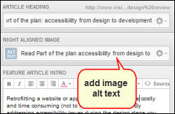
Image alt text defines image purpose
WCAG success criterion: 1.1.1.Image alt text must inform screen reader users of the purpose of the image. Where the image is a link, the purpose is generally the ‘destination’ of the link. Decorative images need an empty alt attribute (alt=“”).
I determined that the images in our e-newsletter were decorative as they didn’t add any extra information. That is to say, if the images were removed readers wouldn’t miss out on any content. These images required NULL alt text (alt=“”). This informs screen readers that the images are decorative and should be ignored. For example:
Important note: In Campaign Monitor there is no way to include a decorative content image from the template because alt text can’t be set to NULL. Leaving the alt text template field empty results in no alt attribute, while populating it with either “” or [single empty space] results in alt=““”” and alt=“ ” respectively. Until this is resolved, Campaign Monitor recommends using “decorative” as alt text.
Step 3: Test the email – display and accessibility
Automated render testing
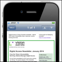 My email looked fine in Campaign Monitor’s preview window, but may have looked completely different in a different environment. I needed to make sure it proved adaptive across a range of email environments, web browsers and devices.
These days you don’t need to send your email to scores of email addresses to see how it looks when displayed in Microsoft Outlook, Apple Mail, Gmail, Yahoo, AOL, Bigpond, etc. Use a render testing service, such as Email on Acid or Litmus.
I used Campaign Monitor with Litmus, which rendered my email in 26 desktop and mobile environments in one click. This test confirmed that my email displayed well across a range of environments.
Manual accessibility testing
My next step was to make sure the email retained its structure in various environments. Would keyboard access, heading markup and the other accessibility factors I built into my email be retained in different email systems?I chose a few environments to test in that spanned desktop email, webmail and portable email. These were:
- Desktop email: Microsoft Outlook 2010
- Webmail: Gmail in Internet Explorer 9
- Apple Mail on iPhone 4s
I tested the following elements using Vision Australia’s Web Accessibility Toolbar (WAT):
- Keyboard access and visual focus
- Image alt text
- Structural markup, e.g. headings and lists
- Reading order
- Zoom
- Portable devices
Keyboard access and visual focus
WCAG success criteria: 2.1.1, 2.4.3, 2.4.7.
The purpose of this test was to find out if I could reach all email content using only my keyboard. I tested in a desktop email and webmail environment.
Technique:
- Open the email in Outlook.
- Put your mouse aside.
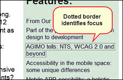
- Starting at the top of the page move through the email using your keyboard Tab key.
- Can you reach all interactive elements (links, buttons, etc.)? Are they reached In a logical sequence?
- In each case, is your location identifiable with a change in appearance such as a dotted border?
- Can you activate links buttons using Spacebar or Enter?
- Open the email using Gmail on Internet Explorer and repeat steps 2-4.
Image alt text
WCAG success criterion: 1.1.1.
The purpose of this test was to make sure all images had an alt attribute. I tested in a webmail environment.
Technique:
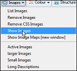
- Open the email using Gmail on Internet Explorer.
- Using the Web Accessibility Toolbar, select: Images > Show Images.
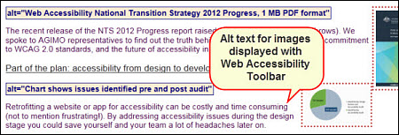
- Review the alt text for each image. Decorative images should display alt=“”.
- Images without an alt attribute will display “No alt!”, and must be corrected.
Headings
WCAG success criterion: 1.3.1.
The purpose of this test was to ensure headings were marked-up according to a suitable hierarchy. I tested in a webmail environment.
Technique:
- Open the email using Gmail on Internet Explorer.
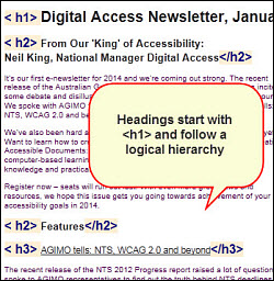
- Using the Web Accessibility Toolbar, select: Structure > Headings.
- Check that each heading is ‘wrapped’ in HTML heading tags, as shown in the example below.
Lists
WCAG success criterion: 1.3.1.
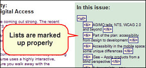
The purpose of this test was to ensure all lists were marked-up properly. I tested in a webmail environment.
Technique:
- Open the email using Gmail on Internet Explorer.
- Using the Web Accessibility Toolbar, select: Structure > List items.
- Check that lists are identified as ordered (ol), unordered (ul) or definition (dl) HTML list tags, and that list items are each wrapped in <li> tags, as shown in the example below.
Reading order
WCAG success criterion: 1.3.2.
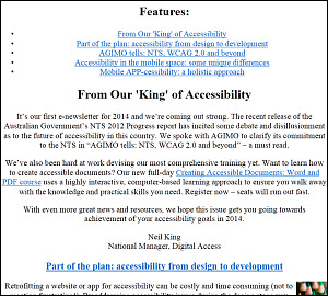
The purpose of this test was to check that screen readers would read the content of the email in a logical order and in the way I intended. I tested in a webmail environment.
Technique:
- Open the email using Gmail on Internet Explorer.
- Using the Web Accessibility Toolbar, select: CSS > Disable CSS, then: Tables > Linearise to strip away styles and table structure.
- Check that the content reads in the order you expect.
Zoom
WCAG success criterion: 1.4.4.
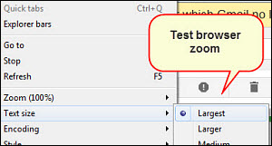
The purpose of this test is to ensure page content can be zoomed to at least 200% without loss of content or function. I tested in a desktop email and webmail environment.
Technique:
- Open the email using Gmail in your web browser (e.g. Internet Explorer).
- Increase text size to 200%. For example, in Internet Explorer select: View > Text size > Largest.
- Check that all of your email content and functions are available and unobscured.
Portable devices
It’s important to check that your email reads and functions well in portable devices because so many people use smart phones and tablets to read emails nowadays. I chose to test on an iPhone 4s, which has an in-built VoiceOver screen reader.
My Litmus test already showed me the email displays well in Apple Mail, so I just have a couple of accessibility tests to run to ensure my email is:
- Scalable with ‘pinch zoom’ (WCAG success criterion 1.4.4).
- Available to VoiceOver screen reader users.
Text resize:
- Send the email to an address you can check on an iPhone.
- ‘Pinch zoom’ with your fingers to increase text size.
- Make sure you can reach all of your content.
VoiceOver:
- Activate VoiceOver: Settings > General > Accessibility > Voiceover.
- Read the content aloud by ‘finger swiping’ across the screen, making sure that all content is read including image ‘alt’ text.
My email accessibility testing checklists
Editable master template
|
Test |
Check |
|
Table(s) optimised to preserve logical reading order |
|
|
True heading styles used |
|
|
Text colour contrast is sufficient |
|
|
Template images have suitable alt attributes |
|
Email content
|
Test |
Check |
|
Subject line is concise and descriptive |
|
|
Headings summarise content that follows |
|
|
Link text is meaningful (not “read more” or “click here”) |
|
|
Content images have suitable alt attributes |
|
Pre-flight testing (desktop email and webmail)
|
Test |
Desktop |
Webmail |
|
Content is fully keyboard accessible and demonstrates visual focus |
|
|
|
All images retain alt text |
|
|
|
Headings, lists and structural HTML markup is retained |
|
|
|
Reading order is logical and as you intended |
|
|
|
Page content zoomable to 200% without loss of content or function |
|
|
Pre-flight testing (portable device)
|
Test |
Check |
|
Email can be finger ‘pinch-zoomed’ |
|
|
All content is read by portable device screen reader (e.g. VoiceOver) |
|
Digital Access at Vision Australia
For more information about accessibility consultancy services for businesses please visit the Digital Access section of our website.


